Project: InaSAFE
Version: 4.0.0
One of the improvements we have been working towards is the ability to produce non-tabular 'infographic' reports. Tabular data is information dense but often hard to communicate with, whilst infographics provide an opportunity to interpret an analysis outcome with a quick glance. Currently infographics are only produced for population exposure based reports, but we plan to add additional infographic reports in the future. One thing to note is that since we still occasionally experience layout issues with the infographic reports, we consider this feature experimental, but we are including the outputs in InaSAFE 4.0 so that we can get early feedback on the feature. For each population exposure analysis carried out, a PDF and an html (web page) document will be produced in the analysis working folder.
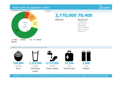
The population exposure infographic consists of a number of components:
- The estimated population donut chart: This provides an at-a-glance break down of how many people are thought to be affected in the hazard zone.
- The affected to displaced section: This contrasts how many people were thought to be affected by the event in total, with how many are thought to be displaced (having to leave their home and possessions and take up temporary residence in an Internally Displaced Persons camp).
- The minimum needs section: This enumerates what the key humanitarian requirements are estimated to be for those persons displaced. Note that minimum needs are configurable in InaSAFE from within the
Plugins -> InaSAFEmenu.
This feature was funded by DFAT/WB-GFDRR